
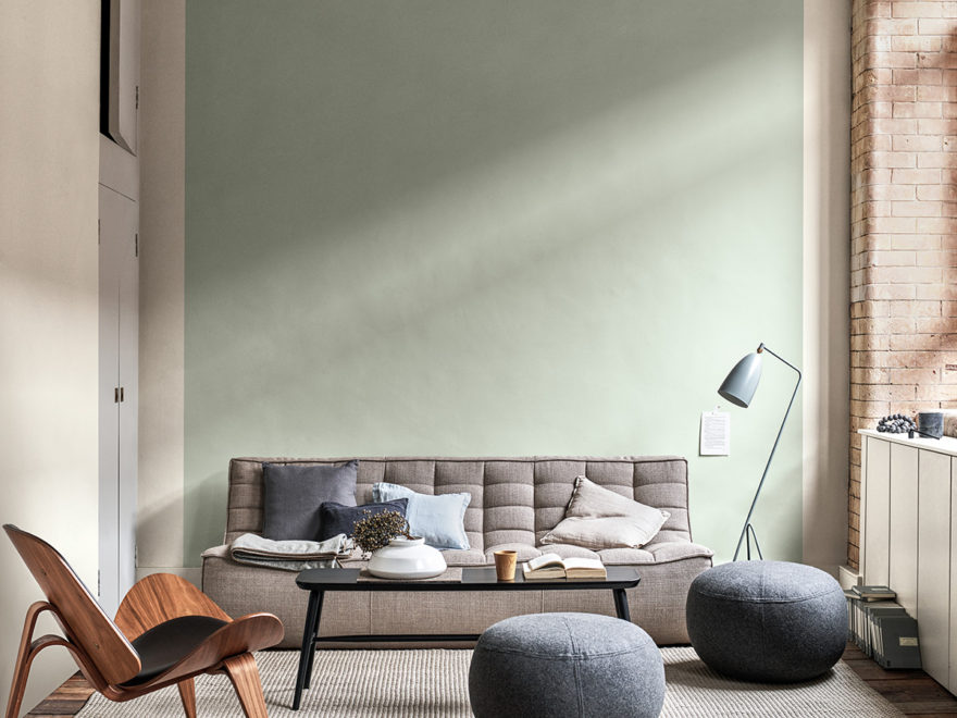
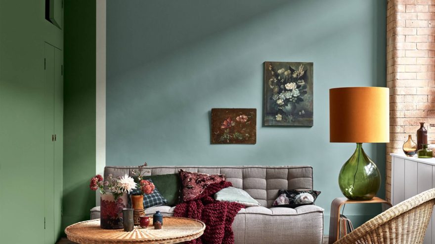
Last month, Dulux announced the 2020 Colour of the year and it is totally swoonworthy. The Dulux colour specialists at the AkzoNobel Global Aesthetic Centre in the Netherlands carry out extensive research into the trends and color that influence our lives and how they reflect in our homes. They have identified one hero paint colour for 2020 that perfectly encapsulates and expresses our collective living spaces today – Tranquil Dawn.
PS: Have you seen my kitchen update with the new Dulux EasyCare? A Matt paint that is really really easy to look after!
New decade, new dawn
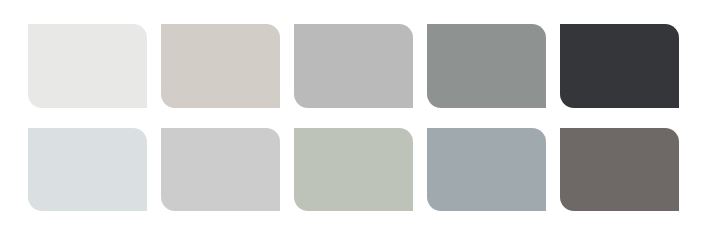
A delicate, fluid shade somewhere between green, blue and grey, Tranquil Dawn is supported by four palettes, each featuring the Colour of the Year as the hero. The palettes are designed to empower and inspire customers, while making the task of choosing colour easier. Each of the Color Palettes below can be used to transform virtually any room in your home.
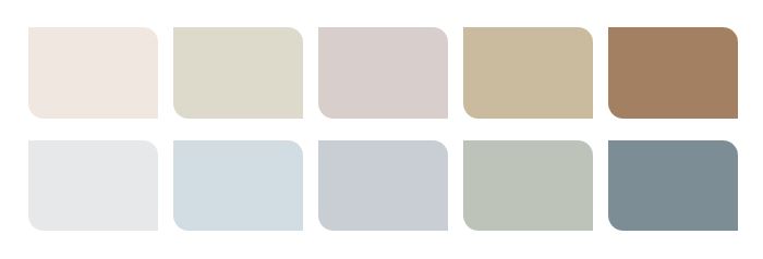
The Care Palette
This palette is soft and airy – a mix of gentle neutrals, including the Colour of the Year Tranquil Dawn, is reminiscent of the horizon of a hazy spring morning – where the colours of dawn flow into one another. This palette allows you to create a space for time to focus on what really matters; relationships, relaxation and YOU.
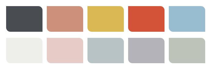
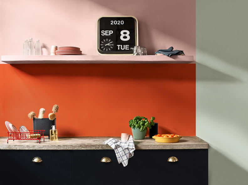
The Play Palette
A palette inspired by the colours of the horizon on a bright summer day, mixing softer shades like Colour of the Year, Tranquil Dawn, with smaller blocks of bold colour, such as coral and Sulphur-yellow brings an offbeat vibrancy to the palette.
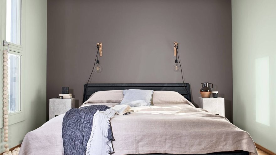
The Meaning Palette
A palette that allows for a space of silence and contemplation, awe and wonder. A subtly nuanced palette of crisp greys evokes the clear horizon of a cold winter’s day, with Colour of the Year, Tranquil Dawn, at its heart. The Meaning palette allows you to create a space where you can be still and free of distractions, to focus on purpose and values.
The Creativity Palette
The Creativity palette is rich and saturated, inspired by the colours of a warm autumn day and full of intense tones, including forest greens and earthy ochres, as well as paler, in-between shades like Colour of the Year Tranquil Dawn.

For more tips on how to do it yourself and turn old to new, visit the Dulux social pages Facebook, Twitter and Pinterest or Instagram.
Let's get social
Instagram: @lovilee_zaTwitter: @lovilee_za
Facebook: @lovileeblog
or subscribe to never miss out on any new articles in this link.


Comments are closed.